How Care Managers Prioritize Interventions Using Contactless Vitals Dashboards
An analysis of how care managers prioritize interventions using contactless vitals dashboards, risk signals, and workflow design to reach unstable chronic patients sooner.
How Care Managers Prioritize Interventions Using Contactless Vitals Dashboards
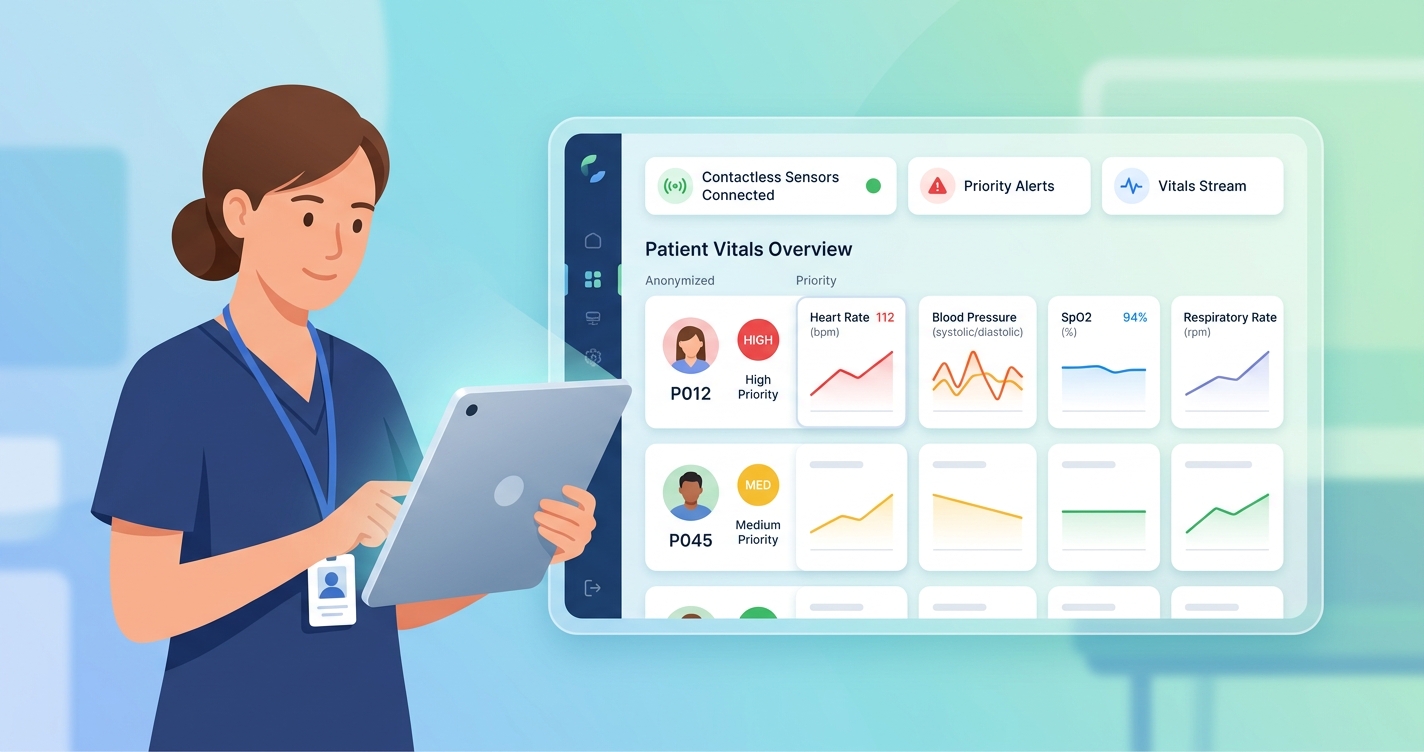
Care managers prioritize interventions using contactless vitals dashboards when the dashboard helps them answer one practical question fast: who is drifting today, and who can safely wait until tomorrow? In chronic care, that matters more than the raw volume of readings. A dashboard only becomes useful when it turns daily blood pressure, heart rate, oxygen saturation, symptoms, and trend changes into a ranked worklist that helps nurses and care coordinators act before instability becomes an admission.
"Remote patient management reduced the percentage of days lost due to unplanned cardiovascular hospital admissions and all-cause death." — Dr. Friedrich Koehler, Charité–Universitätsmedizin Berlin, TIM-HF2 trial, The Lancet (2018)
Why care managers prioritize interventions with contactless vitals dashboards
Most chronic care teams do not struggle because they have too little data. They struggle because too many patients need attention at once. A contactless vitals dashboard is useful when it compresses that flood of information into a manageable sequence: which patient needs outreach now, which patient needs a medication review, and which patient simply needs to stay on the normal monitoring cadence.
That workflow logic shows up again and again in remote monitoring research. In the TIM-HF2 trial, Friedrich Koehler and colleagues built a telemedical workflow around daily transmission of weight, blood pressure, heart rate, rhythm data, oxygen saturation, and patient self-assessments. The telemedical center did not review data for curiosity's sake. Physicians and heart failure nurses used it to decide who needed intervention, medication changes, or escalation. The result was a drop in days lost to unplanned cardiovascular hospitalization or death, from 6.64% in usual care to 4.88% in the intervention arm.
The same operational lesson appeared in the randomized post-discharge telemonitoring trial led by Nicholas L. Dawson, Bryan P. Hull, Priyanka Vijapura, and colleagues. High-risk patients sent daily home readings, and nurses reviewed the data. Within 30 days, the combined risk of readmission or death fell from 23.7% in the control group to 18.2% in the telemonitoring group, while emergency department visits also dropped. The pattern is hard to miss: care managers perform better when a dashboard helps them find change early enough to do something about it.
| Dashboard priority layer | What the dashboard is looking for | Typical intervention | Why it matters in chronic care |
|---|---|---|---|
| Immediate action | Rapid shift from baseline, severe out-of-range reading, symptom escalation | Same-day outreach, clinical escalation, urgent review | Helps prevent avoidable ED use and admissions |
| Short-cycle review | Two- to three-day trend drift, missed check-ins, medication tolerance concerns | Nurse call, adherence check, protocol review | Catches deterioration before it becomes acute |
| Routine management | Stable readings with expected variation | Standard follow-up cadence | Protects staff time for higher-risk patients |
| Engagement risk | Repeated non-submission or incomplete check-ins | Re-engagement outreach, coaching, workflow troubleshooting | Participation failure can break the whole monitoring program |
A good dashboard also ranks change against baseline, not just thresholds. One patient may live comfortably at a blood pressure that would trigger an alert for someone else. Another may look "normal" on paper but show a clear three-day deterioration pattern that a good care manager would never ignore.
How contactless vitals dashboards help care managers prioritize the queue
The strongest dashboards do three jobs at once.
First, they consolidate. Care managers need one place to see recent readings, symptom context, missed check-ins, and prior outreach. Fragmented data slows decisions and creates a dangerous tendency to work from whichever alert is loudest, not whichever patient is changing fastest.
Second, they compare today's signal with the patient's usual pattern. That is why trend views are so important. A dashboard that only flags absolute cutoffs can miss the patient whose readings are steadily worsening but have not crossed a hard threshold yet.
Third, they support action. A ranked list without context is not enough. Care managers need to know whether the next move is a medication question, a same-day phone call, a scheduling intervention, or a handoff to the clinical team.
Researchers working on patient prioritization models in remote monitoring have been trying to formalize that logic. A recent exploration of multi-armed bandit methods for clinical monitoring framed prioritization as a resource allocation problem: limited clinician time has to be directed toward the patients most likely to benefit from outreach. That may sound technical, but the real-world version is ordinary care management. Teams have finite hours, and dashboards are expected to point those hours toward the people most likely to deteriorate, disengage, or miss a quality target.
For chronic care organizations, contactless workflows add another advantage. When daily check-ins do not require a separate wearable or a more complicated device routine, submission friction tends to fall. That matters because participation is the hidden variable in prioritization. If the dashboard receives sparse data, it cannot rank risk well. If the monitoring experience is simple enough to sustain, the queue becomes more trustworthy.
Industry applications for chronic care organizations
Value-based care groups and ACOs
Risk-bearing organizations want dashboards that sort by near-term instability, not just annual risk score. A patient can be high risk on paper and stable this week, while another patient with a lower score may be trending toward decompensation right now. Contactless vitals dashboards help care managers shift from static risk lists to dynamic intervention queues.
Chronic care management vendors
CCM vendors often need to prove that monitoring leads to documented action. A dashboard that shows trend review, outreach history, and escalation logic makes the care model easier to defend operationally and financially. It also helps supervisors see whether staff time is being spent on the right patients.
Post-discharge and transitional care programs
The first 7 to 30 days after discharge are messy. Medications change, symptoms fluctuate, and patients may not yet understand the plan. Dashboards help transitional care nurses spot the patients whose readings and symptoms suggest the discharge trajectory is breaking down.
Multi-condition home monitoring programs
Patients with heart failure, COPD, diabetes, hypertension, and frailty do not fit neatly into one alert logic. Dashboards become more useful when they combine multiple signals into a simple ranking rather than forcing care managers to chase separate disease-specific queues.
For related analysis, see How Quality Measures Improve When Chronic Patients Submit Daily Vitals and How to Reduce Readmissions in Chronic Disease Populations.
Current research and evidence
The evidence behind dashboard-based prioritization is really evidence about monitored workflows.
TIM-HF2 remains one of the clearest examples because the study linked daily data review to a staffed intervention model. Koehler's team at Charité–Universitätsmedizin Berlin and partner centers did not just collect more measurements. They built a telemedical center that reviewed signals, contacted patients, and coordinated next steps. That distinction matters because dashboards only improve outcomes when someone uses them to change care.
The Dawson trial makes a similar point in a broader high-risk population. Patients used home equipment for blood pressure, heart rate, pulse oximetry, and weight when heart failure was present. Nurses reviewed results daily. The intervention reduced readmissions and emergency department use, suggesting that prioritization works best when dashboards move beyond passive observation.
The literature on AI-enabled remote monitoring pushes the same idea further. Recent narrative and literature reviews on AI-integrated RPM describe systems that use risk scoring, pattern recognition, and anomaly detection to reduce cognitive load on care teams. The promise is not that algorithms replace care managers. It is that they help rank who needs attention first when the panel is too large for manual review alone.
Still, the useful dashboards are usually simpler than the hype suggests. Care managers tend to trust tools that make the queue clearer, explain why a patient rose in priority, and connect directly to an action path. A dashboard that produces opaque scores without clinical context often creates more work than it saves.
A few evidence-backed themes keep showing up:
- Daily monitoring works best when it is paired with a defined nurse or clinician response workflow
- Trend change often matters more than a single isolated reading
- Readmission reduction depends on early prioritization, not just data capture
- Engagement monitoring belongs in the same dashboard because missing data is itself a risk signal
- Lower-friction monitoring improves the reliability of the intervention queue
The future of care managers prioritize interventions contactless vitals dashboards
The next generation of dashboards will probably be judged on workflow discipline more than on visual design.
Priority lists will become more trajectory-based
Care managers do not need bigger dashboards. They need better ordering. Expect more systems to rank patients by change from baseline, recent deterioration, and likelihood of benefit from outreach instead of by static threshold violations alone.
Contactless monitoring will matter more in chronic care panels
Large chronic care populations rarely stick with programs that demand too many peripherals. Contactless check-ins make sense because they reduce setup burden while preserving a steady monitoring rhythm. That gives care managers a better signal foundation for prioritization.
Documentation and intervention logic will merge
The dashboard of the future is not just a display. It becomes the record of why a patient moved up the queue, what outreach happened, and what happened next. That is useful for quality improvement, reimbursement, and staff supervision.
Frequently Asked Questions
What do care managers look for first on a contactless vitals dashboard?
They usually look for recent change from baseline, symptom escalation, and missed check-ins. Those signals help identify who may need same-day outreach versus routine follow-up.
Why are dashboards better than reviewing readings one by one?
Because prioritization depends on context. Dashboards can combine trends, severity, engagement history, and prior outreach so staff can focus on the patients most likely to benefit from intervention.
Do contactless vitals dashboards replace clinical judgment?
No. They support it. A dashboard can rank the queue and surface changes, but care managers and clinicians still decide whether the right response is coaching, medication review, urgent evaluation, or continued observation.
Which chronic care programs benefit most from this approach?
Heart failure, COPD, diabetes, hypertension, post-discharge monitoring, and mixed chronic-disease panels all benefit when care teams can quickly identify who is becoming unstable between visits.
Care management gets better when the queue reflects reality instead of guesswork. That is the real value of contactless vitals dashboards: not prettier charts, but faster recognition of who needs help now. For organizations building chronic disease programs with less device fatigue, solutions like Circadify's chronic care management platform fit the shift toward simpler daily check-ins and more actionable intervention queues.